Jetpack Compose is a modern Android UI toolkit that simplifies building user interfaces through a declarative approach. One of its essential components is the OutlinedTextField, which allows you to create input fields with ease. In this blog post, we will explore the OutlinedTextField and how to use it effectively.
What is OutlinedTextField?
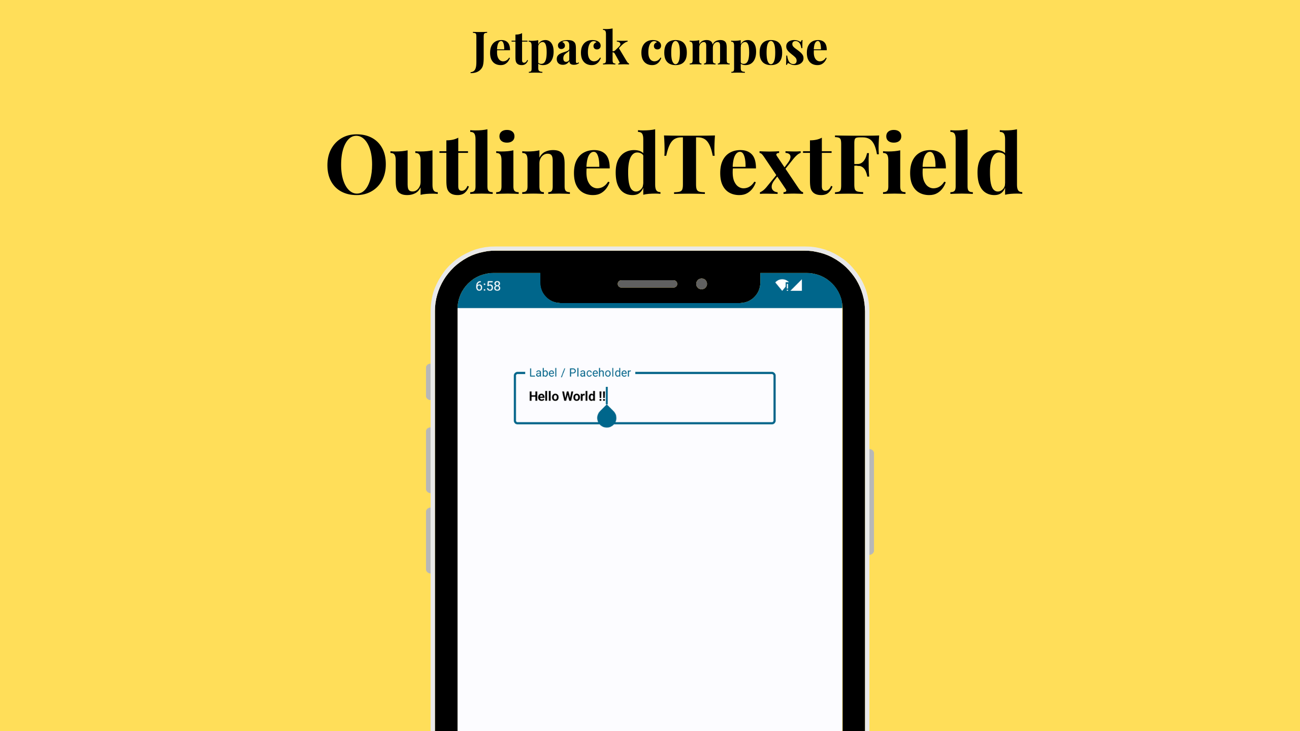
The OutlinedTextField is a Composable that provides a sleek, outlined text input field for your Android app. It’s perfect for scenarios where you need user input, such as a login form, search bar, or any other data input tasks. OutlinedTextField allows you to customize the appearance and behavior of the input field, making it a versatile tool for your UI needs.
Getting Started
Let’s dive into a simple example to get you started with the OutlinedTextField. Below is a code snippet that demonstrates how to create an OutlinedTextField within a Composable function:
@OptIn(ExperimentalMaterial3Api::class, ExperimentalComposeUiApi::class)
@Composable
fun OutlinedTextFieldDemo() {
    Column(
        modifier = Modifier
            .padding(40.dp),
    ) {
        val keyboardController = LocalSoftwareKeyboardController.current
        var value by remember { mutableStateOf("") }

        OutlinedTextField(
            modifier = Modifier.padding(20.dp),
            value = value,
            onValueChange = { value = it },
            label = { Text("Label / Placeholder") },
            maxLines = 2,
            textStyle = TextStyle(color = Color.Black, fontWeight = FontWeight.Bold),
            keyboardOptions = KeyboardOptions(keyboardType = KeyboardType.Text, imeAction = ImeAction.Done),
            keyboardActions = KeyboardActions(
                onDone = {
                    // Handle the user pressing "Done" on the keyboard
                    keyboardController?.hide()
                }
            ),
            isError = value.isEmpty()
        )
    }
}
In this code, we start by defining a Composable function named OutlinedTextFieldDemo. It sets up a simple UI layout using a Column Composable. Inside the Column, we create an OutlinedTextField.
Are you ready to revolutionize your Android development journey? Dive into the second edition of “Jetpack Compose by Example,” available in print, Kindle, and PDF eBook formats. Perfect for Kotlin-fluent Android developers, this comprehensive guide takes you through the ins and outs of Jetpack Compose’s declarative approach.
Key Properties
Let’s break down the essential properties of the OutlinedTextField:
valueandonValueChange: These properties control the value and its change callback. Thevalueproperty stores the text input, andonValueChangeis called whenever the text changes.label: This property sets the placeholder text or label for the input field.maxLines: It determines how many lines of text can be entered into the field. In this example, it’s set to 2.textStyle: Customize the text style, such as color and font weight.keyboardOptions: You can specify the keyboard type and IME action for the input field.keyboardActions: This property defines actions when the user interacts with the keyboard, such as pressing “Done.”isError: You can indicate an error state by setting this property. In the example, we check if the input is empty and mark it as an error.
Wrapping up
Jetpack Compose’s OutlinedTextField is a powerful tool for handling text input in your Android apps. You can easily customize its appearance and behavior to suit your specific needs. We hope this guide has helped you understand how to use the OutlinedTextField effectively. Now, you can start creating beautiful and user-friendly input fields in your Composable-based Android app. Happy coding!


Leave a Reply