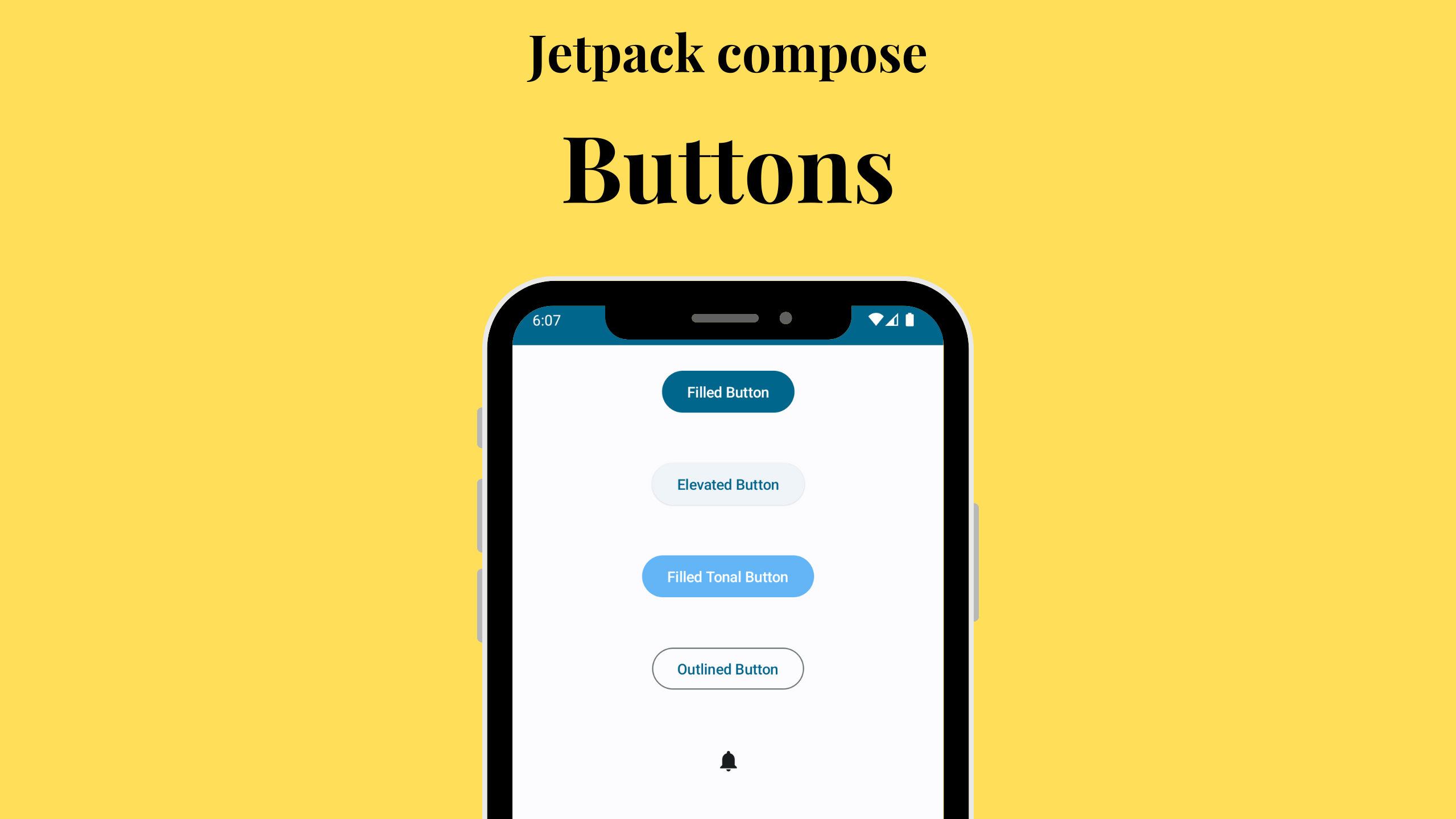
1. Filled Button
The Button with no specific styling is a filled button with a default style. You can customize the button’s appearance by providing a custom color scheme.
Button(onClick = { /* Handle button click here */ }) {
     Text(text = "Filled Button")
}
2. Elevated Button
An ElevatedButton is designed to stand out more than a simple button. It uses a different visual style with shadows to give it an elevated appearance.
ElevatedButton(onClick = { /* Handle button click here */ }){
      Text(text = "Elevated Button")
}
3. Filled Tonal Button
In this example, we’ve created a button with a custom color by modifying the ButtonDefaults.buttonColors. This results in a visually distinct, tonal button.
Button(
     onClick = { /* Handle button click here */ },
     colors = ButtonDefaults.buttonColors(
                containerColor = Color(0xFF64B5F6)
)) {
       Text(text = "Filled Tonal Button")
}
4. Outlined Button
The OutlinedButton provides a button with an outlined style. It’s a great choice for actions that should be less prominent but still easily accessible.
OutlinedButton(onClick = { /* Handle button click here */ }) {
   Text(text = "Outlined Button")
}
Customizing Buttons
Jetpack Compose provides a wide range of options for customizing buttons. You can change the button’s appearance, text style, and more by modifying the composable functions’ parameters. For example, you can adjust the button’s colors, text style, or even add custom shapes.
Leave a Reply